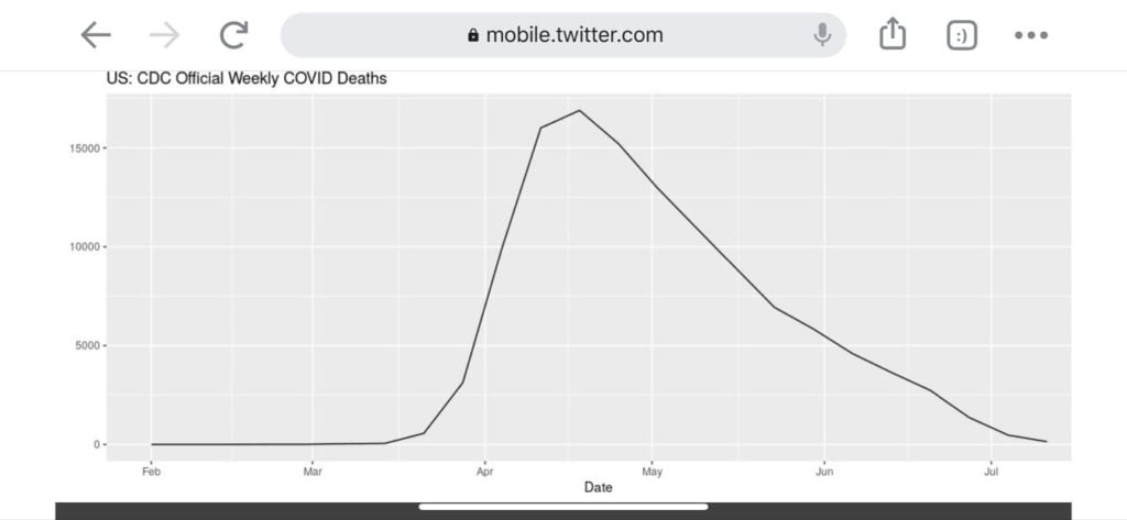
| Sponsored Message Dear Concerned American, The coronavirus hysteria is back dominating the headlines. But there's one chart that "they" - power-hungry politicians and the mainstream media - don't want you to see: This image - created with official CDC data - shows that COVID-related deaths are nearly back to pre-pandemic levels. So why all the hysteria? As I explain in this short video, it all has to do with Election 2020. And it has some pretty eye-opening consequences for Baby Boomers and anyone else in or nearing retirement. This is the most important COVID analysis out there, so I encourage you to check it out immediately. Sincerely, Dr. Ron Paul
 © 2020 Blaze Media LLC. All Rights Reserved. You are receiving this email because you opted in to receive emails from Blaze Media. 8275 S. Eastern Ave, Ste 200-245 Las Vegas, Nevada, 89123, USA |
Monday, September 21, 2020
The COVID image they don’t want you to see
Subscribe to:
Post Comments (Atom)


No comments:
Post a Comment